JRM’s Mohawk Project Featured on Interiors + Sources

07/25/2018
Source: Interiors + Sources
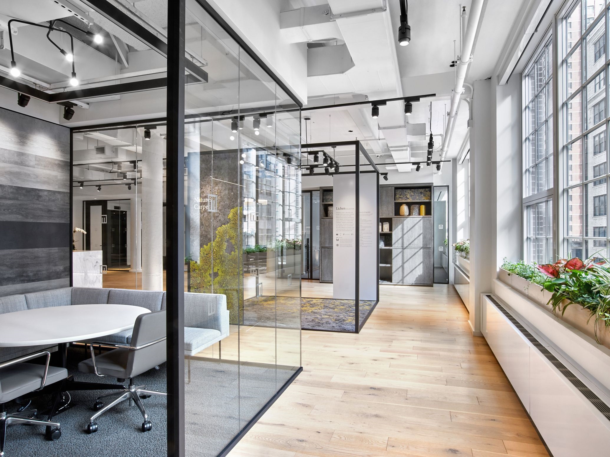
Creating a new image for established brands can feel downright impossible at times, particularly if that brand is Mohawk Group. With almost 150 years at the forefront of the flooring industry, Mohawk enlisted global architecture and design firm Gensler to use the opportunity to push the brand’s image beyond common conceptions in the design of their 8,500-square-foot New York City flagship showroom.
As a stepping stone, Gensler invited a cross-section of designers from those just starting out to senior principals to provide their opinion of the brand. From there, Gensler designed the showroom to address the user’s experience, the brand’s direction, and overall functionality of the space.
“It was really great to get this cross-section of people and their thoughts around what they perceive [Mohawk Group] to be,” said Jean Anderson, principal and design director at Gensler. “A lot of people know Mohawk for carpet and carpet only. That was an interesting data point for us to work with because Mohawk wanted to showcase all their different offerings. That was definitely at the forefront of how we looked at all the different spaces within the showroom.”
User’s Experience
Flipping the script on users’ expectations of Mohawk begins the moment one enters the showroom. Against expectations, the flooring used is from their hardwood lines, showing the range of Mohawk’s offerings. “The best comment I heard while I was in the showroom came from a designer who asked, ‘Whose wood is this on the floor?’” laughed George Bandy Jr., vice president of sustainability and commercial marketing at Mohawk Group. “I said, ‘That’s Mohawk.’”
By using Mohawk’s products in new and interesting ways, visitors are able to see their own projects in the layout. “[Mohawk] wanted to make sure that when clients come in, or when anyone from the design industry comes in, they get a sense of, ‘Oh, wow! I could do this kind of design, think about design this way for [my client],’” Anderson said. “We took a lot of opportunities in this stage.”
One way in which Gensler flipped the stereotype of what Mohawk is as a brand and product was to literally flip the use. “In one of the conference rooms, we have a plank ceiling, and we have those planks wrapped in carpet,” Anderson continued. “It created this kind of acoustic ceiling installation, but we used their flooring, which is not meant to be used on a ceiling. They’re kind of turning [the conventional notion of what a flooring material should be] upside-down.”
Additionally, in tying to the brand’s direction, Gensler “really led the charge on that look,” Bandy said. “That feeling that you know some of the emotional aspects of the space and having almost like that comfortable feeling like you’re home. It’s a loungy yet still design-driven type of space. Gensler did a really good job of creating that type of atmosphere inside of the space so it doesn’t feel… officey.”
The Brand’s Direction
Sustainability and wellness have become a cornerstone of the Mohawk brand, so it was obvious that the New York flagship showroom should likewise highlight the importance for designers to take these characteristics into consideration in their own designs. “We’re leveraging our sustainability acumen as well,” explained Bandy, “and creating a ceiling for people to think about how they eat, how they exercise, how they come to work, how they do that as a part of the culture – not separate from it.”
In “leveraging [Mohawk’s] commitment to believing in better,” as Bandy described it, it became important to the brand that the space meet WELL Platinum and LEED Gold certification. However, that elite status and commitment to the brand’s direction tied into both the overall functionality for their employees and the user’s experience.
“I think a lot of the [design was] created in terms of the way we put our product out into the marketplace: How do we create a retail yet commercial space that fosters innovation and allows people to want to be there? We wanted to have people come hang out, sip coffee, and eat organic treats inside of our space.”
Overall Functionality
Although the showroom is meant to give Mohawk products a stage, it is, in the end, a functional work environment for their employees as well. “Usually the people who work in these showrooms have offices that are kind of hidden in the back and no one gets to see them,” Anderson explained. “What we did here was we made it really a part of the larger space itself. It felt very fluid… the workstations have a mobile strategy where they completely retract. It feels like this is a very curated experience, even when you walk into the workspace part of the showroom. It feels like it’s part of the bigger whole and that the team is there to help anyone who walks in.”
“It was caveat for us to begin to think about how we create a feeling from evoking an even better mindset; first with our associates,” said Bandy. “People who actually work for the organization deserve to be fostered in their location that allows them to believe in better. I think it’s unfair for us to create and manufacture solutions to help other people secure their goals for WELL and LEED certified facilities without demonstrating that we also are going to practice the same effort for our associates.”


)