JRM Acts as General Contractor for Sony’s US Headquarters

06/09/2016
Source: Interior Design
Studios Architecture Composes a Perfect Harmony at Sony’s US Headquarters
Philip Johnson went way out on a limb, architecturally speaking, with the broken pediment crowning his New York headquarters for AT&T in 1984. But kitsch be damned, that postmodern Chippendale roof launched Johnson’s star into the stratosphere. The Sony Corporation of America later acquired the tower and rebranded it, then sold it three years ago to a real-estate developer planning to convert the offices into a hotel and apartments. Preparing to move on, Sony enlisted Studios Architecture to guide the search for a new HQ—something as architecturally legit as the Johnson building is winkingly ersatz.
The answer turned out to be not a whole branded tower but 570,000 square feet on 10 levels at the top of an art deco landmark constructed by the Metropolitan Life Insurance Company and now occupied by such other tenants as Credit Suisse and the mega-agency WME/IMG. The discreet Sony logo, not too big, is placed low, on the granite base of the building, as well as high up, over the entrance to the lobby. Inside, a multi-panel LED video wall stands out against the refreshed beige marble.
At the back of the lobby, imposing escalators connect to a mezzanine reception area built exclusively for Sony. Gleaming in white marble and terrazzo, the grand double-cube proportions were created by removing a portion of a floor slab. Furnishings are intentionally spare, Studios CEO Todd DeGarmo notes: “The Japanese have an opposition to ostentation.” Bass booms on the sound system, as music videos pulse across another LED billboard. “When you’re Sony, keeping the material fresh isn’t so hard,” the Interior Design Hall of Fame member adds.
Elevator cabs retain their deco ceiling fixtures, like something out of a Fritz Lang spectacular, with glass lenses added for more light. The cabs themselves are lined with milky glass, a striking contrast to the Sony elevator lobbies’ walls of blackened steel, inspired by the familiar black all-caps logo. Black corridor walls are furthermore crisscrossed by glowing Tron-like slashes.
DeGarmo and associate principal Tara Roscoe had long conversations with the heads of each label about the design vision for their particular space. “People at Sony derive their professional identities from the individual businesses under the corporate umbrella,” Roscoe says. One bigwig asked her, “Can we just sit on the floor and spread out these finishes?” As she recalls, “He said it was the best part of his day.” (Then begged her to revamp his house in the Hamptons.) L.A. Reid, the former X Factor judge who is chairman and CEO of Epic Records, keeps a dozen scented candles burning throughout the Epic suite.
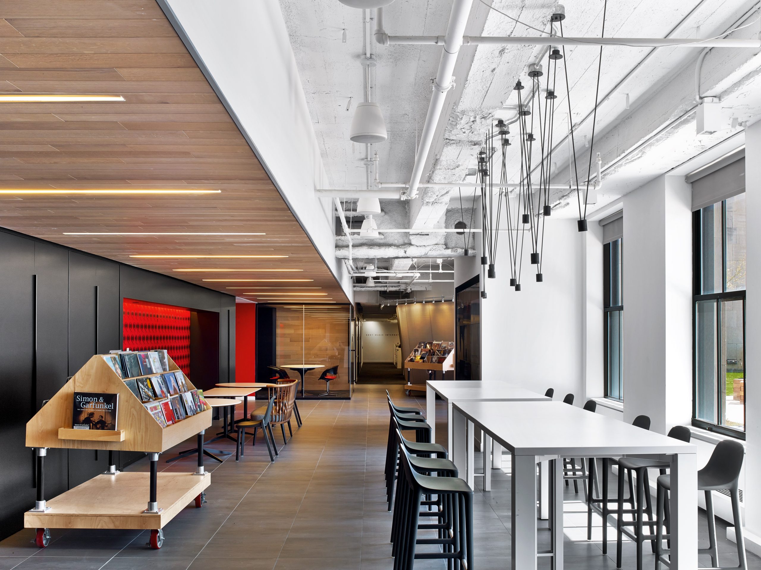
Nevertheless, Studios did seek to update Sony’s attitude toward workplace layouts. “At the old location, you might have thought they were selling file cabinets,” Roscoe jokes. Kit-of-parts options for furniture and finishes differentiate the various brands—what she calls producing personalized space in a systematized way. “It was very important this not feel like a corporate aesthetic imposed on them,” DeGarmo says. Each of the brand levels has an elevator lobby with a black wall on one side, for orientation, and a branded installation opposite. Reception areas are likewise individualized. Columbia Records even has a “record shop” display of LPs in their original shrink-wrapped colorful cardboard covers.
Founded in 1887, Columbia later became the home of artists including David Bowie, Adele, and Beyoncé. Wall covering and upholstery in the office therefore showcase historical branding and tweak it. Another legacy label, RCA Records, which represents Foo Fighters, Shakira, and Mark Ronson, features a large mural of the classic RCA Victor logo. “It’s really all about that dog,” Roscoe says with a laugh.
Above the levels for specific labels, the executive level comes with its own reception area and a screening room. A new staircase offers direct connection up to the penthouse, with private dining rooms at one end, a piano lounge at the cinched center, and a skylit cafeteria at the opposite end—for the first time, there’s a space big enough to allow an entire business group to gather. From the cafeteria, a floating stair rises to the roof. The scheme for the roof terrace is truly beyond compare, made possible by the building’s checkered history: A tower intended to rise from the current structure was never built during the Great Depression. Across the resulting expanse, Studios conjured a sky-high leisure landscape of pavers and picnic tables. Happy-hour barbecues serve up an unobstructed view of the Empire State Building and, perhaps in the distance, a sliver of Johnson’s Chippendale crown.
Project Team: David Burns; Eric Hofmann; David Must; Lang Shaw; Maria Pacheco; Margarita Mileva; Garrett Brignoli; Loren Heslep; Sarah Levine; Sejal Bhimjiani; Caitlin McCarthy: Studios Architecture. Airspace: Graphics Consultant. Kugler Ning Lighting Design: Lighting Consultant. Arquitectonica Geo: Landscaping Consultant. AVTEG Consulting Engineers: Audiovisual Consultant.Longman Lindsey: Acoustical Consultant. Thornton Tomasetti: Structural Engineer. AMA Consulting Engineers: MEP. Petrillo Stone: Stonework. Miller Blaker; Modern Woodcrafts; Rimi Woodcraft Corp.; Svend Nielsen Design: Woodwork. Zonca Terrazzo & Mosaic: Flooring Contractor. JRM Construction Management: General Contractor.


)